
The Gavel Gap
Researchers working with the ACS gathered information on the demographics of state count judges in all 50 states. What they found were huge disparities in the make-up of race and gender of the courts and the communities that they represent. This is called The Gavel Gap, and it's a big deal.
Chi/Donahoe reached out to Michelle LeClerc to visualize this campaign. Before we knew it, we had designed a large body of work: 3 infographics, 1 logo, 17 illustrated frames, and a 28-page report.

Impactful Visualizations
A series of sharable infographics were created to highlight key findings and draw the audience in from social channels and online media outlets to the report, which explores the issue in detail.

Character Design
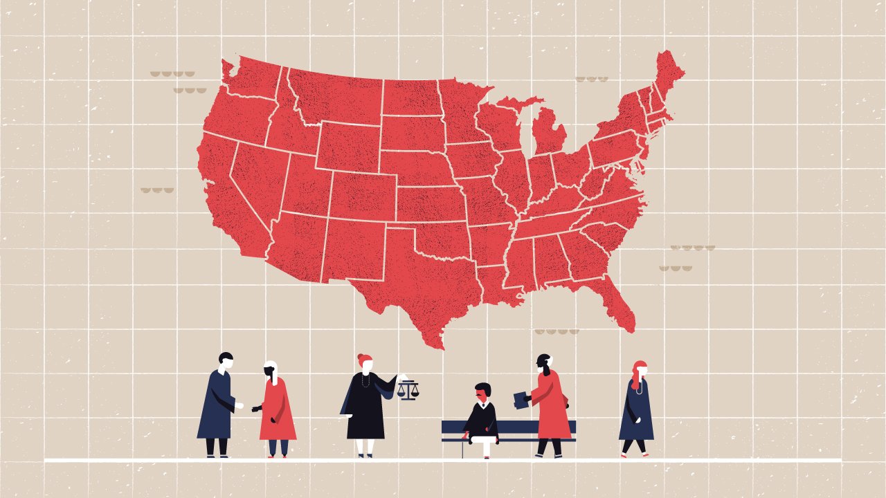
Care was taken to design characters that were diverse in race, gender and ability. The structure of the illustrations needed to convey urgency, which is a challenge with a medium that is often associated with playfulness. To do this, we lengthened our characters, and created sharp, unfriendly edges. We further accentuated this with a dark, impactful color palette.
Tailoring the design to the medium.
-
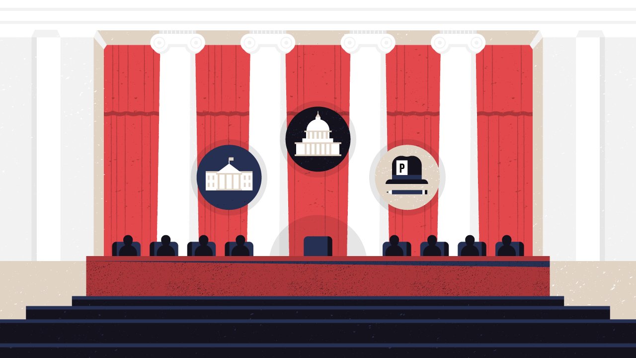
The animation called for detailed environments and iconography to enforce the spoken narration.
-

By contrast, the report features simple data visualization to support the research, not draw the eye away from it. Patterns are used along with strong color contrast for accessibility.
-

Infographics required both detailed environments and data visualization. They rely on a narrative to convey key information.